The Challenge
When Carphone Warehouse came to us they did so because they weren’t where they wanted to be as an online presence. Their existing digital strategy wasn’t delivering results and was letting their brand down.
The eCommerce store was dated and difficult to use; it didn’t reflect their amazing in-store customer experience. Carphone Warehouse were worried – How could they claim to be tech experts with such an out-of-date web presence?
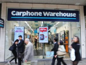
The brief was simple in context: mirror the excellent in-store experience, online.
The Solution
We carried out an extensive UX research and discovery process, after which we concluded that Carphone Warehouse embodied three pillars:
- Great customer service
- Impartiality within their market
- The ‘go-to’ agent for understanding and advice
We then created a web strategy that translated these core strengths into a true online version of the Carphone Warehouse experience. We used Kentico as the perfect content management system for the project, chosen for its flexibility and ease of use for both front and back end users. The site offers a fresh new approach to presenting the top mobile phone providers online offerings. Through extensive prototype and user experience testing, it matches and accurately reflects the great customer experience that is expected in their real world stores.
There were also a number of technical challenges to overcome, including getting the site to interact with several different legacy systems all of which need to communicate with one another for a seamless operation. This includes interfacing with stock, billing and delivery systems to ensure that all are being updated to show the correct date in real-time. Our experienced development team were able to connect the different systems and incorporate them into one eco system.
The Results
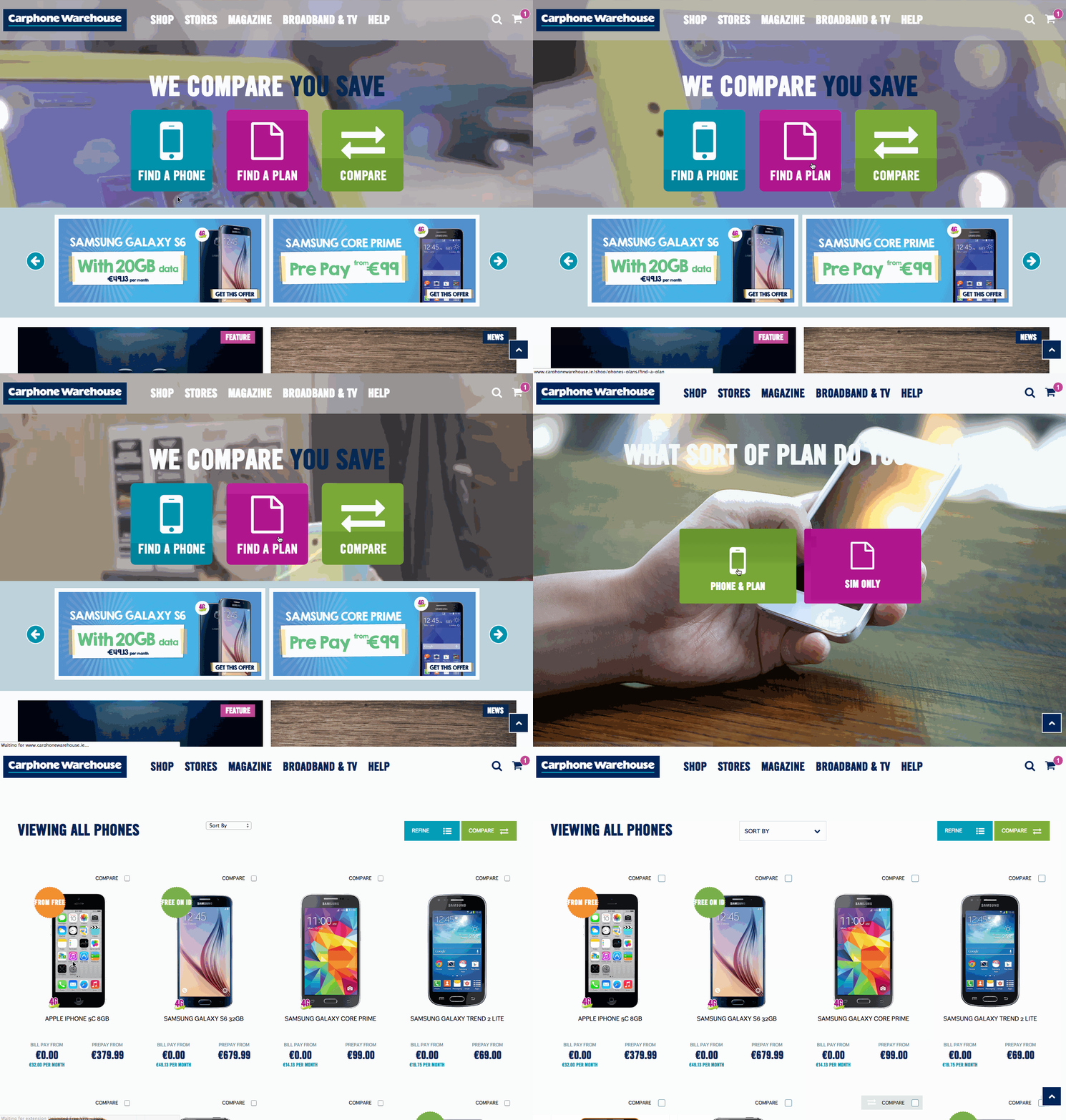
The cutting edge design offers the correct blend of informal communication, eye catching design and ease of use for customers. The site itself is quite visually stimulating with minimal, easy to read text. This allows for greater synergies between the web and mobile versions of the site.
The site has outperformed expectations and had become a shining star in our portfolio. It has gone on to win numerous industry awards including:
- Accenture Digital Media Award for Best Site/Microsite
- Kentico Global Site of The Year for Best Customer Success Story
- Retail Week Awards Retailer of the Year
Carphone Warehouse now have a site that they can be proud of, which accurately reflects them as a business and mirrors their offline customer experience in an online capacity.
Our Services
- Web-design
- Web – Development
- Graphic design
- SEO
- UX Testing
- Kenitco Implementation and Training
- eCommerce Solutions
A Little Bit More…
Big Decisions, Easy Choices
Buying a new phone or changing mobile network provider is always a pain. Poor user experience leads to the process being abandoned and it’s not made any easier by ineffective websites and jargon.
We wanted everything on the Carphone Warehouse site to help guide you to make your choice, not get in the way.
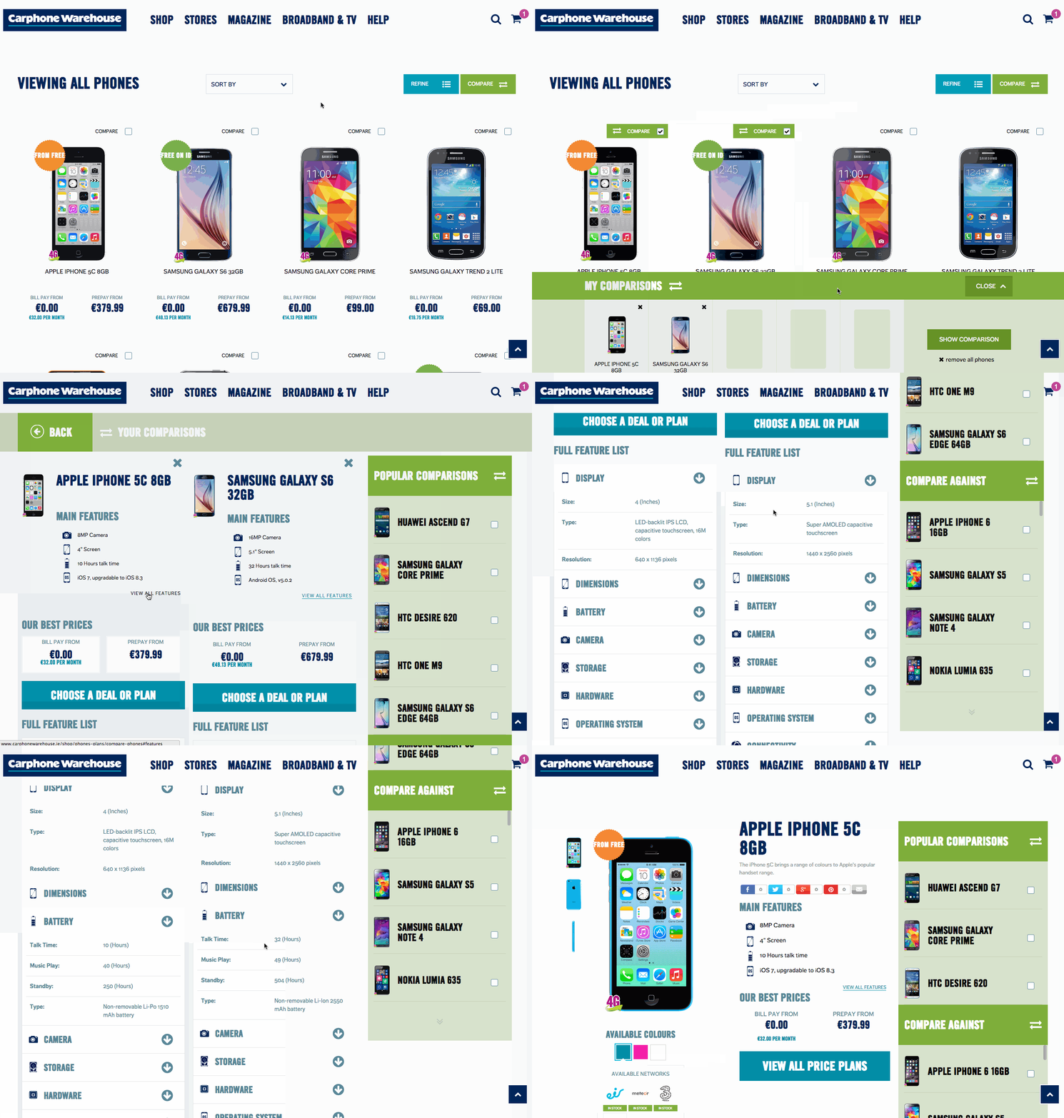
That’s why we created a calming, easy-to-use experience centred around big buttons and bright colours.
Using straightforward, chunky text and friendly icons customers intuitively know where to click for their most common needs. There’s no need to search through navigation menus, just point, click, and make your choice!
Comparing Devices & Plans
A common in-store question might be, “Which is better, the HTC One M8 or the Samsung S6?”. A Carphone Warehouse staff member could talk to you all day about that but their website didn’t capture the same experience.
Online, we created a means to empower the user with the same information and allow them to figure it out for themselves. Presenting: the Carphone Warehouse Comparison Tool.
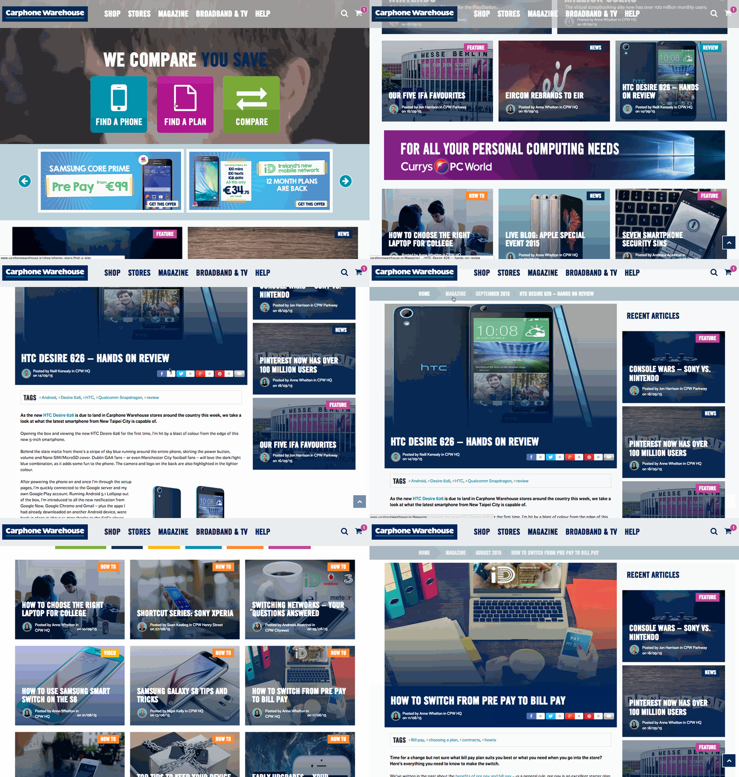
The Comparison Tool enables the customer to view a range of phones side-by-side to truly compare like-for-like, reinforcing their decision process point-to-point.
The customer can easily compare plans, cutting through the hard-to-decipher fine print of contracts between different providers.
Expert Advice & Opinion
In-store, Carphone’s customers get impartial, expert advice to help them choose the best device or network provider for them.
To replicate this service online, Continuum created a fully-fledged tech magazine written by actual store staff who give opinions and advice on devices, news, and developments in the tech world.
Reviews appear alongside devices giving customers expert unbiased opinions when they need it.
And of course, creating stellar online content is good for enticing new customers to the site and keeps existing customers coming back.
Cutting Through the Red Tape
Even the most beautiful eCommerce experience (and that’s what we think Carphone Warehouse embodies) can be undone by the level of legal red tape required to sign up to a new mobile phone contract.
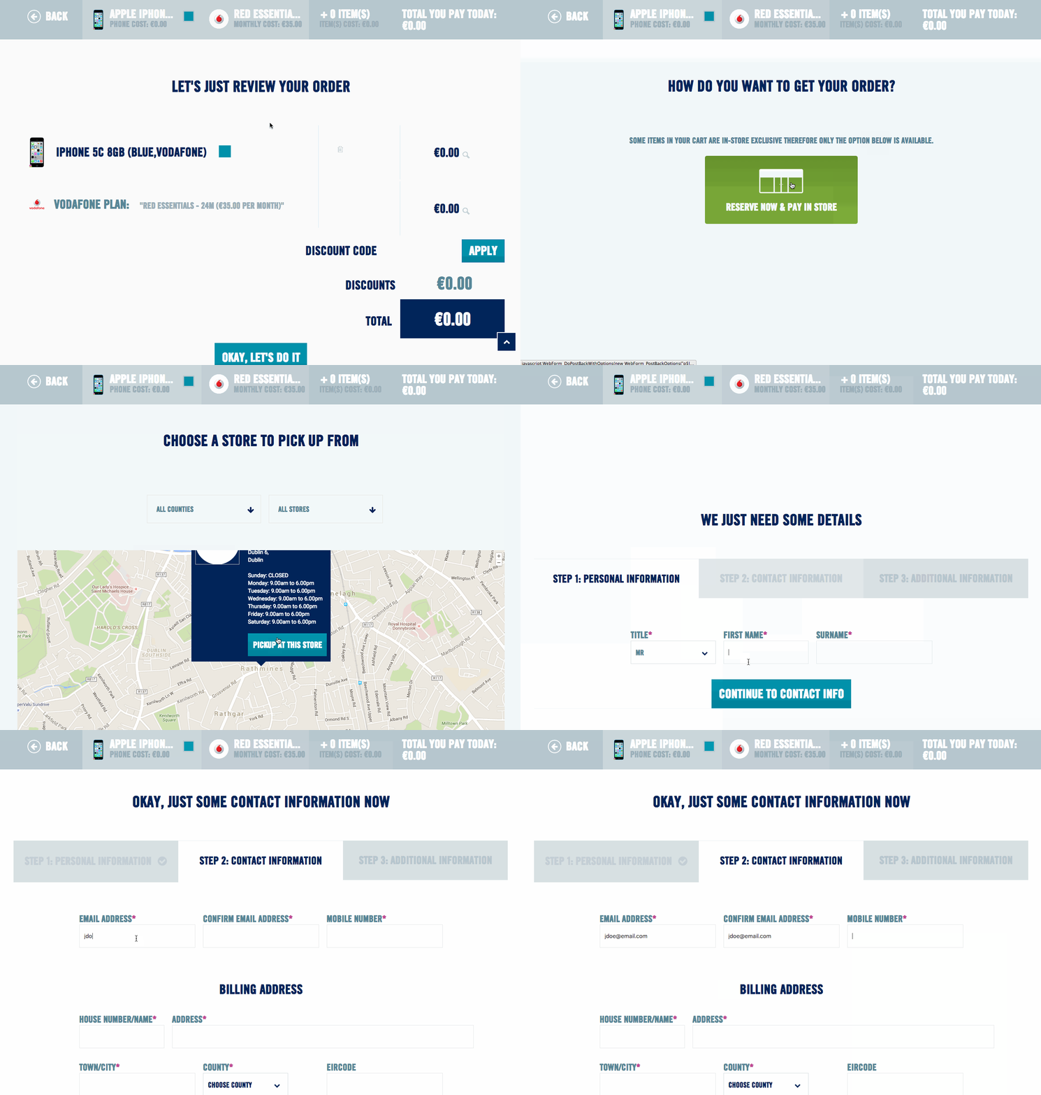
Fully aware of this, Continuum created a new type of checkout to take the pain out of the process.
Rather than being overwhelmed by interrogating forms, the customer glides from step to step, pressing big buttons to make choices and answer questions effortlessly.
As a final step, they can choose home delivery or in-store pick-up. Using a nifty map, the customer can choose their nearest store and simply drop in when their order’s ready for collection. Simple!
How We Did It
Observe
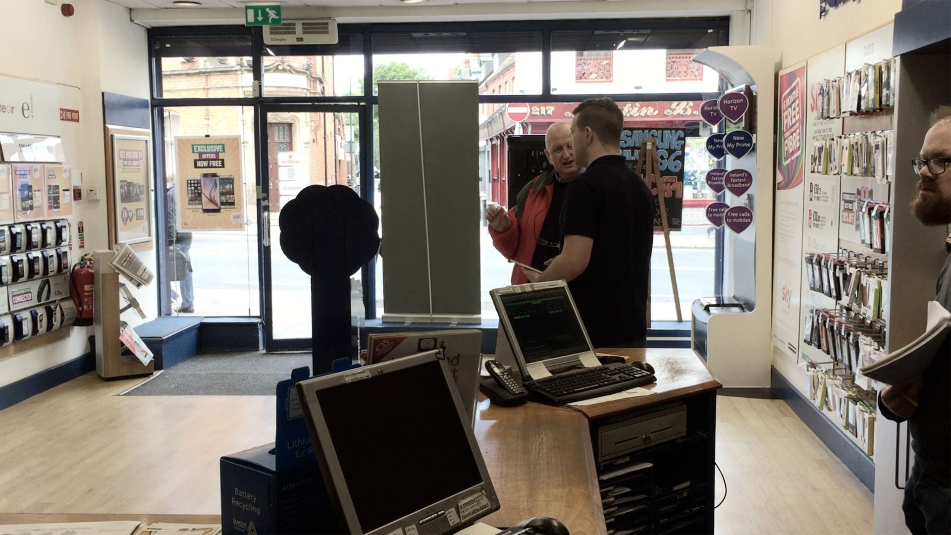
To replicate Carphone Warehouse’s in-store experience, first we had to see it in action.
We dispatched our intrepid designers to perform undercover reconnaissance in CPW stores all over Ireland. Acting as mystery shoppers, we recorded our experiences and observations.
Next, we spent three days in a Carphone Warehouse store, observing techniques, interactions and pain-points in the customer experience.
Finally, we brought CPW’s top sellers into a round-table workshop to hear more from the masters.
Test
Having created pen-and-paper models of how we thought the website would work, we created a working prototype using Invision.
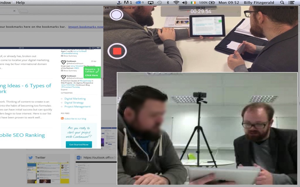
Bringing real people into our testing lab, we set them tasks on the prototype. As they worked, we filmed their facial expressions, recorded their reactions and screen interactions.
After each round of testing, we compiled our data and discussed the results as a team. We learned what was working, where we got it wrong and where we needed to improve our designs. Then we did it all over again, iterating towards the final version of the website.
Impact
Starting with the Carphone Warehouse branding, we created an aesthetic which enabled a shop, a magazine and a complicated sign-up process to speak the same visual language.
We employed iconography and colouring to create consistently intuitive elements across all devices.
Lifestyle imagery was brought into the website to create a visual contrast with the more minimalist layouts of the shop.
We employed fast-moving video to create a visual metaphor for CPW’s shop window on the homepage. The video formed an abstract background, helping the main CTA buttons to stand out.
Under the Hood
We used Kentico CMS as the backbone for the website. This powered the core of the eCommerce and Magazine elements.
Our crack team of developers stretched and extended the system, creating the Comparison Engine, Plan Sign-Up and the brand new Checkout system.
The customer can sign up to any one of five different mobile phone providers. Each provider has differing needs for their sign-up process as well as different marketing and legal requirements as part of this process.
Additionally, the site speaks to the CPW in-house stock database, returning stock numbers and availability for every item in every store nationwide.


